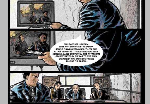
To start the new year off, I'm going to show you some basic lettering techniques for your comic book. For this initial tutorial I'll be using Adobe InDesign (I'll be showing it on version CS6 - I know this is out of date at this point, but the technique carries over to the latest CC version).
Once you have final artwork for your comic, you can begin to letter it. InDesign, in my opinion, is the best program to use for this purpose. You can use Adobe Illustrator as well, but InDesign is better suited for page layout and large amounts of text. It can be done in Adobe Photoshop, but I wouldn't recommend it. It won't be as easy to edit and the text features aren't conducive to word balloons.
Ok, enough rambling. On to the tutorial.
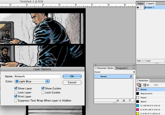
1- Place PSD or EPS of the artwork onto it's own layer.
cmd+d is the keyboard shortcut for placing files into InDesign. The artwork file size should match the document file size set up in InDesign. Label the first layer "artwork" (can be labeled anything that makes sense to you so you can easily identify what's on that layer).
Once that layer is created, lock that layer.
2- Create a new layer and label it "Live Text".
3- Copy the live text from the original script. Take only the text that will be in the first word balloon.
(I'm going to use panel 2 for this instance since it has a little more text to work with).
4- Create the shape of the word balloon in InDesign and paste in the text.
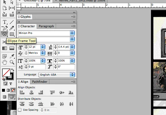
Select the Ellipse Tool Frame. Drag out the shape you want to use on the Live Text layer you just created on top of the panel that the text relates to.
Select the type tool.
Click inside of the ellipse you just dragged out. This will turn the shape into a text box. Then paste in the type from the script. (Note: this technique will work for any shape you create)
5- Format the balloon with a font and background color.
For this step you can experiment however you see fit. For me, I selected the font Helsinki. I kept the type black and made the balloon background white with no border line. The font size was set to 7 pt and was center aligned both horizontally and vertically. That will give you this initial look.
6- Adjust formatting.
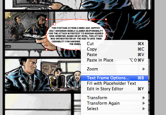
Right now the text is hitting right up against the edge of the balloon. So to correct this, you add in some spacing inside of the balloon. (Similar to padding in web design).
Click on the text box and right click. Select Text Frame Options.
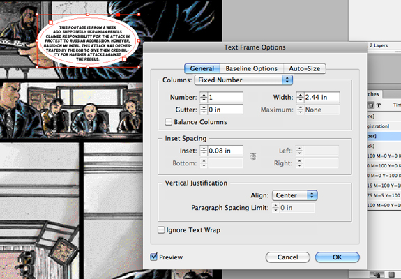
Add in the Inset Spacing. This will bump the text away from the edges. You can play around with this to get it how you like it. You should see the live preview as you adjust the size.
Click OK and then you can drag the corner points of the balloon around to adjust the word flow as you see fit. You can go back in and fine tune the Inset Spacing as needed.
7- Add in speaker device.
So this is referring to the small element that comes off of the balloon to indicate who is talking. Again you can experiment with this and make whatever shape you want. For this tutorial I'll just keep it to the traditional style of the triangle. I generally will use the pen tool to draw out a simple shape.
>
So that's the general technique for lettering a panel using Adobe InDesign. You'll follow these same steps for every following panel. The fun part is then experimenting with typefaces and placement within each panel.
I recommend reading tons of comics to see the different styles that are out there for lettering. There are certain general ways to indicate whose talking and who might be talking off panel. Study how the masters have done this and then play around with different approaches. Just be careful not to go so far out there that the reader doesn't understand the flow of the conversation.
Hope this helps. Any questions, leave a comment.
Thanks for reading.

