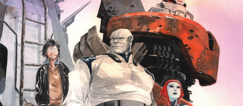
This lettering study examines the work of Steve Wands on the sci-fi epic series, Descender.
One of the biggest areas of distinction in this series is the variety in typefaces and balloon treatments that are used. In many comic books, the font remains consistent throughout the entire book. There may be variances in size or an italic here and there, but in general the font always remains the same.
In this first example, we see three different word balloon treatments and three different fonts. Not only do the balloon treatments have different shapes, but the colors change as well. This creates a set of visuals all their own. A departure from many of the mainstream comics on the market today. By having the font be the same for every character, it allows the artwork to take on a slightly more dominant role. With a technique like this, the type becomes interwoven with the artwork itself.
A page later, another font is introduced. This one having more disjointed segments to it. The benefit of this approach is furthering the personalities of each of the characters talking. So when there are robots speaking, the font is more pristine and uses a sans serif to parallel how a robot may sound visually. Offsetting this is the traditional comic book font that is more hand written. This font is attached to the human characters more often than not in the series.
Above is another instance of this personal touch. The balloon has a contrasting color scheme and small graphics that further allude to the fact that this is a computer talking. Here we see another modern sans serif font offsetting the traditional hand lettering font of the main character.
This example is a slight modification on the traditional font. It is still has the hand lettered effect, but uses italics to match the creepy tone of what the character looks like. The more rigid balloon also helps further the tone.
Another unique example of how the fonts can remain consistent, but a slight change to the outline treatment of the balloon can marry perfectly with the visual details of the character.
CONCLUSION
Adding a plethora of fonts and word balloon treatments can help elevate the personality of each character being portrayed in a series. It does break the standard of traditional lettering in comic books, which can be jarring to the purists out there. However, a balance needs to be struck from going too wild with fonts that it becomes distracting to the beauty of the artwork. It should also have a purpose as to why it is being used. In the case of Descender, there is a clear range of diverse characters set in a futuristic world that makes this technique feel natural for the series.
And that will do it for this lettering study. If there are any series that stands out with their exceptional use of lettering, send over the title in the comments.
Here are all of the credits for the Descender artwork and writing seen above.
Jeff Lemire (Writer)
Dustin Nguyen (Artist)
Steve Wands (Letterer)
Image (Publisher)
Release Year: 2015

