SHAPE. COLOR. CONTENT. MY TAKE ON LOGOS.
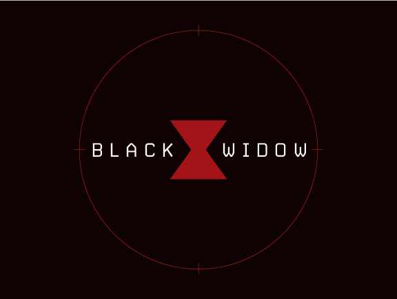
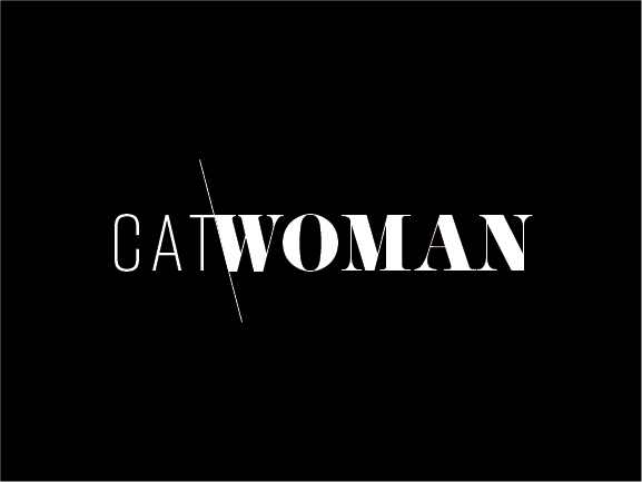
For this challenge, I tackled logo design. I began with taking logos that were existing, but in my opinion lacked solid design principles. I decided to give them a makeover. Eventually, as most of my challenges do, I moved towards comic books for the subject matter. I took existing characters and gave them my interpretation of their title design as a simplified logo. I have always found logos to be a difficult aspect of graphic design. Being able to make a compelling visual as simple as possible, yet say a lot about a specific brand or person is a feat unto itself. The examples below were my attempt at improving this vital skill.
RULES
DAY 266 TO 300
Below are the rules/themes I tried to stick to for this months challenge.
- Spend roughly 45-60 minutes per logo
- Base the design off of existing content
- Keep it as a flat vector based file (no photography/photoshop)
- Unlimited colors
DESIGNS
DAY 266 TO 300
I will have another post coming in the next few weeks with a bit more detail, but this will be my last post of the daily design challenge. I have some new and exciting creative endeavors that I am moving on to next. I still encourage anyone that is reading or looking for a creativity boost to make a challenge of their own. I found it greatly rewarding and I am proud of much of the work that came out of this undertaking.


