DIGITAL UI/UX DESIGN
PROCESS
Uncle julio’s
Uncle Julio’s is a polished casual Mexican restaurant with over 30 locations throughout the U.S. The redesign of their site optimized the user flow for mobile, simplified the use of the menu, made finding locations more streamlined, and brought the brand look into modern times.
Deliverables
Website
RESPONSIBILITIES
Concept | Wireframes | Prototyping | Design
Some key stats after the redesigned site launched
39%
INCREASE IN SITE SPEED
42%
INCREASE IN MENU VIEWS
23%
INCREASE IN SESSION DURATION
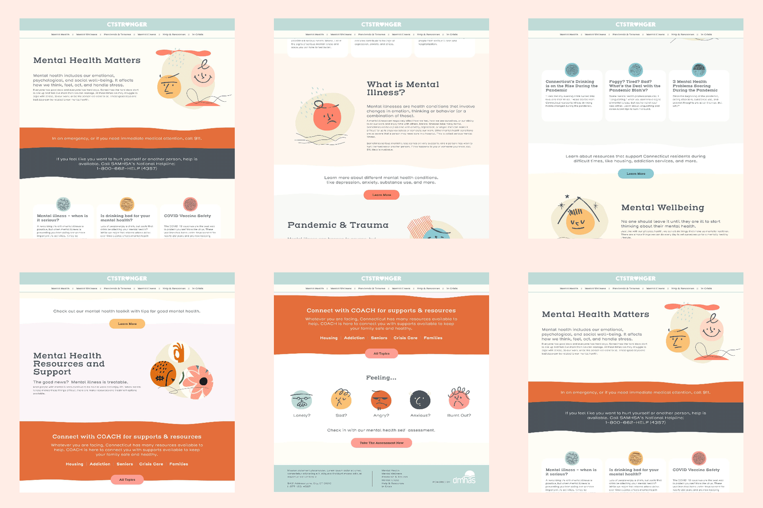
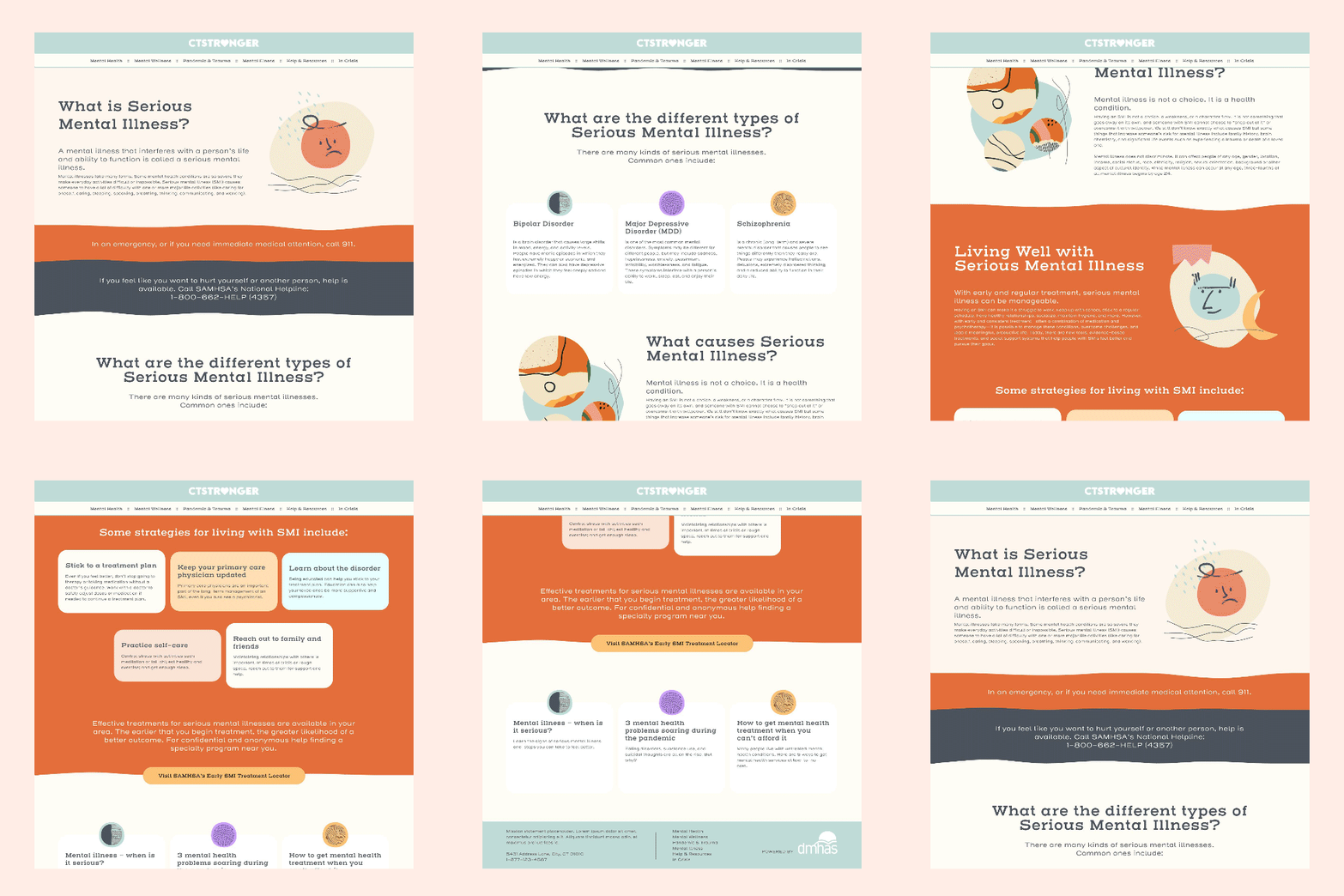
DEPT. OF MENTAL HEALTH & ADDICTION SERVICES
This site design was a part of a campaign focusing on mental health for the state of Connecticut. The aim was to have a quick hitting resource for people struggling with their mental wellbeing and to provide them with avenues to seek help. The design focused on the varying moods people experience, but in a style that was inviting and friendly.
Deliverables
Landing Page Concepts
RESPONSIBILITIES
Design | Prototyping | UX & UI
SNP TECHNOLOGIES
SNP is a company that specializes in simplifying complex technologies in the cloud space for a wide range of customers needs. They wanted the new site to be friendly and have a more abstract visual take on the theme of collaboration. The site itself was incredibly robust, clocking in at over twenty intricate pages. Based on the that the design sought a clean and structured layout to make navigating the content as easy as possible.
Deliverables
Website
RESPONSIBILITIES
Concept | Wireframes | Prototyping | Design | UX & UI
DEWALT | TOUGH SYSTEM MUSIC
Dewalt was launching their new job site portable stereo. They wanted a microsite that allowed users to see all of the latest and greatest features. The offered up videos as well as 360 degree rotator of the stereo itself. We then created a concept to support the launch that focused on classic album art that was incorporated into the stereo or surrounding construction sites.
Deliverables
Microsite | Print Ad
RESPONSIBILITIES
Concept | Wireframes | Prototyping | Design
AWARDS
2016 W³ AWARD SILVER WINNER
AVI NETWORKS
Avi is a company specializing in cloud technology for application services. The goal was to redesign their site and provide a simplified approach to explaining a complex subject.
Deliverables
Website | Collateral
RESPONSIBILITIES
Concept | Wireframes | Prototyping | Design
VIEWICS
Viewics is a healthcare analytics company based out of California. They were looking to raise more awareness of their offerings and needed to rebrand their identity. This included creating all of their collateral materials as well as a massive website redesign and overhaul.
Deliverables
Brand Guidelines | Personas | Collateral | Website
RESPONSIBILITIES
Design | Wireframes | Prototyping | UX & UI
SILENTPAC BY ACCURATE
Accurate created a new line of products that greatly reduces the amount of noise made from a variety of locks. They required a new logo that the product line could live under, but still be in the same visual thematic as the main brand. In addition they wanted a landing page that could provide some introductory information about the products themselves. The focus was to be on the scenarios that people would use the product as well creating simple ways to show how dramatic the noise difference really was.
Deliverables
Landing Page
RESPONSIBILITIES
Concept | Wireframes | Prototyping | Design
USER INTERFACE PROTOTYPES
These designs are a part of the daily design challenge that I created for myself (See my blog for more detail on the challenge). The focus of each design was to create a digital interface for something that is typically non-digital (analog).
Deliverables
Prototypes
RESPONSIBILITIES
Design | Prototyping | UX & UI | Animation
Digital interface concept for an digital toaster.
Smart phone interface design for a TV remote control.
Smart phone app design for a bike speedometer.
User interface design for a dehumidifier.
Smart phone user interface for a crock pot.
Redesign of shot timer app.
Smart watch interface design for a garage door opener.


